Showing posts with label Drawing. Show all posts

Wednesday, 8 May 2024

Enlargement without Maths

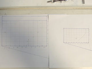
 Setting out an enlargement grid can be done without the mathematics of ratios.  It uses an old method of estimated interval size and angles relating to the ends of the estimation and the width of the design.  This gives the method in simple images.

     Start with your original design


Draw line at a shallow angle from one corner


Determine number of grid lines (say 10) along the bottom edge.  Choose a length approximately the size needed for the grid.  Mark out the number of divisions with dividers or compass on that slope.


Connect the final mark with the corner at the end of the line started on.  Place a right angle on that line.


   Fix a long straight edge under that right angle and fix it so it does not move


·        Transfer the marks on the sloped line to the edge of the image.


This gives ten equal divisions. Adjust the divider opening to the width of the division.


Use dividers with this opening to transfer the division size to the other edge.


Do this on all four edges if a rectangle.


Do the same process for the enlarged size.

Draw a slope


Estimate the size of the division.  Mark that estimate on the slope as for the original design.  Fix a right angle between the end of the slope marks and the corner of the design.  Fix the straight edge and mark off the divisions on the enlarged size.  Transfer these divisions with the new division opening of the dividers

Draw the grid.


Note where the design crosses the grid lines. Transfer marks onto the enlarged grid proportionally.  To avoid confusion, mark one line in at a time.


An intersection of the design line two thirds up the design grid vertical gets a mark two thirds up the corresponding enlarged vertical.  The same with horizontal grid lines.  Connect the dots one line at a time in pencil.  They can be altered later and erased once the final lines are inked in.


Friday, 25 November 2011

Beautiful Design Lines

Principles of design practice for stained glass, 3

Stained glass is a graphic medium where line and colour are very important. Achieving pleasing lines and forms requires practice and use of various approaches and techniques.

The two dimensional world is one of abstract thought. Work and development are the way to creativity – there is no mystical talent. Practice drawing every day – set aside time to do it, if you normally shy away from drawing as an exercise.

Study and learn from what has gone before. Look at the images and objects you admire and analyse what you like about them and why. Also consider what things could have been done differently. Consider how those changes would affect the character of the piece.

Of course, maintaining your creative attention is difficult, so when blocks occur try some or all of these things:
  • Put the work aside for a day or two before taking it out and looking at it again.
  • Alternatively, pin up the design on a wall where you can look at as you pass by. When you see a change to be made, do it immediately and pin it back up.
  • Get a new perspective, e.g.:
    • Turn it upside down. This will enable you to observe differences and spot inconsistencies
    • Look at it in a mirror. You might see people studying still life or live subjects together with their drawing in a hand mirror to get a new perspective that will help spot difficulties.
    • Put the design on the floor and climb a ladder to look at it. This provides distance and changes the angle at which you look at your design.

Remember that design tends toward realism or abstraction. You need to work on both forms, remembering that glass is a graphic medium that tends toward abstraction. Working on both forms develops your flexibility and knowledge. Having a working knowledge of both enables you to have a responsive approach to the client.