Showing posts with label Design elements. Show all posts

Wednesday, 8 May 2024

Enlargement without Maths

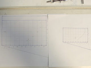
 Setting out an enlargement grid can be done without the mathematics of ratios.  It uses an old method of estimated interval size and angles relating to the ends of the estimation and the width of the design.  This gives the method in simple images.

     Start with your original design


Draw line at a shallow angle from one corner


Determine number of grid lines (say 10) along the bottom edge.  Choose a length approximately the size needed for the grid.  Mark out the number of divisions with dividers or compass on that slope.


Connect the final mark with the corner at the end of the line started on.  Place a right angle on that line.


   Fix a long straight edge under that right angle and fix it so it does not move


·        Transfer the marks on the sloped line to the edge of the image.


This gives ten equal divisions. Adjust the divider opening to the width of the division.


Use dividers with this opening to transfer the division size to the other edge.


Do this on all four edges if a rectangle.


Do the same process for the enlarged size.

Draw a slope


Estimate the size of the division.  Mark that estimate on the slope as for the original design.  Fix a right angle between the end of the slope marks and the corner of the design.  Fix the straight edge and mark off the divisions on the enlarged size.  Transfer these divisions with the new division opening of the dividers

Draw the grid.


Note where the design crosses the grid lines. Transfer marks onto the enlarged grid proportionally.  To avoid confusion, mark one line in at a time.


An intersection of the design line two thirds up the design grid vertical gets a mark two thirds up the corresponding enlarged vertical.  The same with horizontal grid lines.  Connect the dots one line at a time in pencil.  They can be altered later and erased once the final lines are inked in.


Wednesday, 1 May 2024

Enlarging Designs by Hand


Not everyone has easy access to enlarging copiers.  Even when they are available, large enlargement ratios produce distortions.  This presents a dilemma when a big enlargement is needed.  Is it necessary to redraw the whole design at a larger scale?  There is a way to enlarge a design without machines or needing to redraw the whole.  This is a description of how it can be done.

The old fashioned way to enlarge an image is to grid the smaller original.  This grid is normally made in squares of convenient size.  The grid size does not have to fit evenly into the dimensions of the original.  It is easier if the longest side has a size of grid that fits evenly into it.  This probably means there will be an uneven fit of the square grid on the other dimension.  This is not a big problem. 


The size of the grid is related to the amount of detail.  More detailed original images need smaller squares than images with less detail.  Detailed images may require a 1cm/0.375” square grid or less.  This is to ensure all the detail is included in the enlarged image.  A less detailed original may only need a 2.5cm/1.0” grid.

Also, bigger enlargements require more squares on the original than smaller enlargements.  If you are enlarging more than three times, you should be looking toward smaller squares for the grid.  This allows you to maintain the curves and angles more easily on the enlarged copy.  Smaller enlargements can have a larger grid size.  The relevance of the grid size becomes apparent when you set out the enlarged grid.


It is useful to use a set of dividers to ensure the repeated grid size is set out on the boundaries of the original image size.  Once set, the distance between the two points of the dividers remains constant as you “walk” them along the boundaries.  If you mark all four sides of the image with the dividers, you only need a straight edge to draw the grid lines.  I draw the lines in pencil. Then if I make any mistakes, I can erase the lines and set new ones.

On another piece of paper set out the new enlarged size boundaries.  If you have set the boundaries at the correct size relative to the original, the new grid should fit evenly into the long dimension.  Multiply the grid size on the original by the enlargement ratio.  This gives you the size of the enlargement grid.  Set your dividers to this and mark off the enlarged grid.

In fact, most of the time, the difference between the final enlarged and the original size determines the enlargement ratio.  To get this ratio, divide the enlarged size by the original size to get the ratio.  This ratio needs to be applied to the new grid size.  If it does not fit well, adjust the dividers to the required size and mark the length again.

Example:

·        The approved design is 10 by 15cm/ 4” by 6”

·        The final size is to be 60 by 91.5cm/ 24” by 36” (assuming your design is in the same proportions as the final size).

·        Assuming your design is of moderate detail, squares of 1cm/ 0.39” might be enough to capture the detail.  For more detail, smaller squares would be required.

·        To determine the size of the squares in the full size design, divide the final size by the design size.  I prefer to use the bottom side for this calculation, but either side will work. The bottom side of the full size is 60cm, and the design is 10cm. The division shows that the squares on the full size need to be in a ratio of 1:6.0. This means the squares on the full size need to be 6.0cm/ 2.4”.

·        If this appears to be too large a grid, the squares can be divided to capture more detail.


The next blog post will show how to divide the design and full size without using maths at all.

Having marked the edges of the design with the grid sizes, draw the grid across the design.  Do this in pencil, so the grid lines can be erased when the enlargement is completed. This will give intersections between the design lines and both the grids. 

Enlarging involves marking these intersections on the full size grid in proportional locations.  E.g., if on the design the intersection on the grid line is 2/3 up the grid square.  On the large one mark it also 2/3 up on the corresponding square. Do one line at a time to avoid confusion.  When as much of the line intersections as you want for that element are transferred, draw the line in on the full size.  There will need to be some adjustment when finished, so use a pencil for all these operations.


When satisfied with the look of the full size, ink in the lines and erase the grid and any unwanted lines. You now have a full size cartoon to work with. 

Manually enlarging a design is most useful when you do not have access to machines, and when the enlargement is more than two times.  Machines distort the lines at high magnifications and require checking and often redrawing of edges and various elements anyway.

Wednesday, 21 September 2022

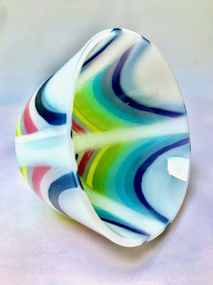
Drop Vase Design for Opalescent Glass

Credit: Missy Mac Glass on Folksy

When making a drop vase in opalescent glass, the design needs to be on the outside.  This will require ensuring the design will be on the bottom when suspended on the drop ring.

It is possible to build the whole piece as normal with the design on the top and fire it.  Then you can turn it over to make sure the design is facing downwards. 

To get a crisper design for the outside the flip and fire technique can be used.  Build from the outer layers to the inner layers.  You are building upside down. Place the design to be seen on the outside of the drop vase down on the prepared shelf first.  Follow this up by placing the inner layers in order from the most outside to the most inside layers.

These instructions rely upon firing the blank first rather than building on the drop ring.

However, you can build on the ring if you need to save one of the two long firings.  Only one modification is required.  Place a sheet of clear down first.  Assemble the design as for a flip and fire technique, i.e., outside layers first, inside layer last.  

This will require a slow heat up to ensure you have allowed enough time for the air to be squeezed from between all the layers and that all the glass at the same temperature before the drop begins.  Sprinkling a fine layer of clear powder over the clear is a good way to assist allowing the air out.  Place the design pieces down before applying the powder. 

This is not the best way to make drop vases, but it can work with care in placing the decorative pieces and applying the powder.

Wednesday, 13 March 2019

Textured Side


There is a little concern about whether the textured side of the glass pieces in leaded and copper foiled glass should be towards the inside or outside.

The traditional advice is to have the textured side toward the inside.  This is based on the piece being used as a window. It is easier to keep the weather side clean if the smooth side is on the outside. The same thinking leads to the recommendation to allow the cemented panel to rest with the smooth (outside) down.  This minimises the thickness of the putty and so allows less water to collect on the outside horizontal leads.

If the window is not primary glazing, it does not matter which side, nor how consistent you are in placing the glass.  It becomes a matter of aesthetics – which ever way you prefer is fine if it gives you the effect you want.

There is a small visual effect if you are using transparent glass.  There is slightly more dispersion of light if the textured side is outwards. 

Placing the textured side inwards can be useful if you wish to indicate a rough surface contrasting with a smoother one.

These considerations show that the placing of the textured side is largely determined by the function of the panel and the aesthetics applied.

Wednesday, 19 April 2017

Light and Dark in Designs

Chiaroscuro – This word borrowed from Italian ("light and shade" or "dark") refers to the modelling of volume by boldly contrasting light and shade. 

Glass artists need to be very cognisant of light and dark, both in terms of colour selection and in terms of density. A very thick dense glass of a dark shade of any colour will create a much more intense darkness than glass that is thinner and less dense.


In terms of colour, lighter hues go where the sun shines or where the eye is to be drawn. Pastel shades indicate brightness and light. Within some opalescent and art glasses it is possible to find a shade of colour graduating to white or light yellow. 


Shading can be achieved by using the white areas to indicate where light is falling. A denser dark glass can be used to indicate where light does not fall, or where very little light can filter through. It can also play the part of negative space.


Sometimes, it is useful to use a monochrome scheme to assist in determining where the light and dark should be, as in this pear:


The contrast between light and dark can be used in several ways. Darkness can indicate depth of field or distance when used in a general landscape. Or, it can be used to bring a foreground out, making other elements more vivid.


The key thing to remember in using stained glass is to not be afraid of dark glasses. They can very useful, even if of very odd hues of colour.

Wednesday, 1 March 2017

Thinking About Design


To think about design, you need a vocabulary to describe the object. This needs to be combined with a structure of principles. What follows is an outline to structure your thinking about design.  This is based on the writing of Burton Wasserman in Spark the Creative Flame, Making the Journey from Craft to Art, by Paul J Stankard, 2013, pp. 25-27.


First there is the language to structure the conversation about design. The elements of this are “… point, line, plane, texture, colour, pattern, density, interval, … space, … light, mass, and volume”

Then there are principles of good design.  They relate to:
  • ·         Unity – all the elements form a whole.
  • ·         Balance – note, not only symmetry, but a distribution of elements that allows each piece to appear to be in its proper place.  Imbalance provides dissonance and tension which can be the purpose of the piece, of course.
  • ·         Rhythm – this can be repetition with or without variation. This provides energy, animation to the piece.
  • ·         Emphasis – or contrast between a main element and the rest. This can be size, colour or placing.
  • ·         Harmony – all the elements work together to form a whole.


These five principles of design together with the vocabulary of elements assist your critical thinking about expressing your design and realising it in the best way you can.  This thinking can be applied usefully to the critical appreciation of others’ works.

I have grouped the elements according to the principles that seem most applicable as follows.  This organisation is not prescriptive. It merely helped me to think about using the language when viewing my own or others' work.


Design Language   

Vocabulary                                 Principles of Good Design


Point                                           Unity 
Line
Plane

Colour                                        Balance   
Light                                                        


Texture                                       Rhythm             
Pattern                                                     
Interval
Space


Density                                       Emphasis 
Mass                                                          
Volume


                                                   Harmony 

Thursday, 25 April 2013

Radiating Lines


In designs for leaded and copper foiled glass it is important to avoid lines radiating from a single point. Some of these reasons are:


It is important to reduce the number of lines that meet in any design to avoid a big bright solder place in a panel.


Example of pattern with radiating lines

It makes for large solder blobs, especially on leaded glass panels, and therefore provides a focus where one may not be wanted or required.

The difference between the harder solder and softer lead came leads - over time - to cracks in the lead at the edge of the thick solder blob.

In leaded and copper foiled glass it is a point of weakness, as there are likely to be multiple thin or tapering pieces of glass that are liable to fracture early in the life of the panel.

Methods of Avoiding

This umbrella image avoids long narrow pieces by having the ribs and supports crossing to make short narrow pieces

Narrow tapering pieces can be compensated for by making the narrow parts shorter than the wider parts of the taper – although this does add to the density of lead and solder around the termination point. There is a difficulty in adapting single radiating points in a drawing to the practicalities of the medium of glass. Examination of older panels (in either technique) will show some of the problems of thin tapering pieces. It is obvious in older windows, especially in the Victorian Era, when tapered pieces where in their glory. Almost always, the tips are broken. It is the nature of glass, and goes back to knowing how the medium will react to the conditions you create.

The central circle avoids joining all the radiating lines at one point

Good design will avoid multiple radiating pieces from a single point of origin.

It is not possible to make a neat termination by joining half a dozen tapers at one point. The finished piece will not look like it did when it was drawn out with a pencil. You can pencil in a termination with six points, ending at one point and it may look good, but when you draw the design with the width of the led or foil will show the clumsy nature of the design with a large termination point.

As you can see, the answer starts with the design, before you cut and foil, or fit the came to the glass. Art is not about the physical placement of what you see in your mind, as much as it is about the "illusion" you are creating that you want others to see. That starts with the design, and avoiding something that you know is going to give you a problem.

It is not possible to make a neat termination by joining half a dozen tapers at one point. The finished piece will not look like it did when it was drawn out with a pencil. 


Example of a design that will present difficulties at the centre

You can pencil in a termination with six points, ending at one point and it may look good, but when you draw the design with the width of the led or foil will show the clumsy nature of the design with a large termination point. As you can see, the answer starts with the design, before you cut and foil, or fit the came to the glass. Art is not about the physical placement of what you see in your mind, as much as it is about the "illusion" you are creating that you want others to see. That starts with the design, and avoiding something that you know is going to give you a problem.

Thursday, 30 August 2012

Radiating Lines

In leaded glass designs it is important to avoid lines radiating from a single point.

Good design will avoid multiple radiating pieces from a single point of origin.

Among the reasons for avoiding radiating lines are:
  • It is important to reduce the number of lines that meet in any design to avoid the big bright solder place in a panel.
  • It makes for large solder blobs, especially on leaded glass panels, and therefore provides a focus where one may not be wanted or required.
  • It also is a point of weakness as the multiple thin or tapering pieces of glass are liable to fracture. 
  • Also the difference between the harder solder and softer lead came leads - over time - to cracks in the lead at the edge of the thick solder blob.

There is a difficulty in adapting single radiating points in a drawing to the practicalities of the medium of glass. Examination of older panels (in either copper foil or leaded technique) will show up some of the problems of thin tapering pieces, especially in the Victorian era where tapered pieces where in their glory. Almost always, there will be broken tips. They seemed to compensate for tip stress by making the pieces with narrow tapers smaller than some of the other wider pieces. Even then, there are a lot of broken ones seen. It is the nature of glass, and goes back to knowing how the glass will react to the conditions you create.


Methods of avoiding tapering pieces lie in the design.

You can't use long tapered pieces in larger panels, without modification for the structural reasons outlined above.

Also you can't make a neat termination by joining half a dozen tapers at one point. Your piece will not look exactly what it looks like when you drew it out with a pencil. You can pencil in a termination with six points, ending at one point and it may look good, but try drawing it in with a felt tip pen almost 6mm wide, which shows for what the solder has to  cover, and see what that point looks like then. For copper foil a 2-3mm wide line will demonstrate what will be seen after soldering. You may not be pleased with the large blob at the termination.

No one can teach one easy fix for everything you will encounter, so the answer starts with the design, before you cut and foil, or fit the came to the glass. Art is not about the physical placement of what you see in your mind, as much as it is about the "illusion" you are creating that you want others to see. That starts with the design, and avoiding incorporating something that you know is going to give you a problem. 

Monday, 5 December 2011

Reworking Designs

Principles of design practice for stained glass, 5

Having created the design, you should consider re-working the designs for a variety of reasons. Some of these are:

- to save time in the later stages of the work. It all too easy in the excitement of creating a new piece to want to get directly on with making, however this often gives construction or design difficulties that have to be solved in the making, leading to compromises. In general far too little time is spent in the design stage. Time spent on the design will be more than saved in the construction and will produce a more satisfactory piece.

- to ensure the structural stability of the piece. Although reinforcement should be considered from the beginning of the design, this is the time to ensure that the piece will stand up to the use it will receive during its – expected – long life.

- Make sure you have investigated every possibility to answer the challenges of your design.

There are a number of activities that can help with these elements.

Reworking will enable you to maintain the essence of the design while simplifying lines and easing the labour of the construction of the panel. Often the design contains a number of lines that are not essential to the whole design.

As you re-work the design, you can make sure every curve, dip and angle are to your liking and so improve the whole. Redrawing also helps understanding of the design and the placing of lines. It will also help in considering the placement of lead came and the widths to be used.

Make sure the design is still structurally sound. The design should avoid long nearly straight lines with few interruptions, especially those that go from edge to edge in any direction. The lines should interlock rather than have many joins onto long lines.

It gives an opportunity to ensure that you can cut all the pieces. This is the time to look at the negative or background pieces to make sure you can cut them as well as the foreground pieces. Usually people are so concentrated on designing the main image that the background becomes too complicated to cut easily.

Make successive tracings with each change, so there is a record, allowing you to step back wards to an earlier version if necessary.

If this re-working stage leads to the realisation of design problems, there are some things that can be tried:
  • Cropping the design can transform it. The focus of the design can be enhanced by removing some of the surrounding “information”. The change of proportions say from landscape to portrait can make significant differences.
  • Enlarging and using only a portion of the original design can be a solution. This is similar to the cropping operation, but has the added advantage of making the pieces larger and easier to cut.
  • Further simplification of background design lines can be considered. This will bring the focus back onto the main part of the image.
  • Changing relative proportions can transform the design, e.g., by enlarging a busy background, it can be made simpler and easier to read the whole panel.
Elements of Design:

Friday, 25 November 2011

Beautiful Design Lines

Principles of design practice for stained glass, 3

Stained glass is a graphic medium where line and colour are very important. Achieving pleasing lines and forms requires practice and use of various approaches and techniques.

The two dimensional world is one of abstract thought. Work and development are the way to creativity – there is no mystical talent. Practice drawing every day – set aside time to do it, if you normally shy away from drawing as an exercise.

Study and learn from what has gone before. Look at the images and objects you admire and analyse what you like about them and why. Also consider what things could have been done differently. Consider how those changes would affect the character of the piece.

Of course, maintaining your creative attention is difficult, so when blocks occur try some or all of these things:
  • Put the work aside for a day or two before taking it out and looking at it again.
  • Alternatively, pin up the design on a wall where you can look at as you pass by. When you see a change to be made, do it immediately and pin it back up.
  • Get a new perspective, e.g.:
    • Turn it upside down. This will enable you to observe differences and spot inconsistencies
    • Look at it in a mirror. You might see people studying still life or live subjects together with their drawing in a hand mirror to get a new perspective that will help spot difficulties.
    • Put the design on the floor and climb a ladder to look at it. This provides distance and changes the angle at which you look at your design.

Remember that design tends toward realism or abstraction. You need to work on both forms, remembering that glass is a graphic medium that tends toward abstraction. Working on both forms develops your flexibility and knowledge. Having a working knowledge of both enables you to have a responsive approach to the client.

Sunday, 20 November 2011

Responsive Colour Selection

Principles of design practice for stained glass, 2

The graphic form of much stained glass means that the medium is about line and colour. This requires that you think about both your and the viewer's response to the colour combinations. Respond to your instincts. Use you feelings about colour and their relationships. Try different colour ways. Formal training does help, but experience develops your skills. The individuality of the piece depends on the use of your instincts about the colour. There are some checks you can make while selecting colours.

Think of colour and impact. Hot colours tend to have more impact, as they give bright points or areas. Impact can also be created by using non-complementary colours together. If a more subtle impression is desired, use tonal variations without great contrasts.

Vary areas of colour and their proportions. This provides interest to a panel. It avoids a mechanical symmetrical appearance, even if the design is symmetrical

Think about colour balance. Although the colours may vary it is important that the weights of the colours are balanced so that the focus of the panel is not taken to another part because of the imbalance of the colour with the design.

When you are in difficulty selecting or arranging the colour, step back and view from a distance. This is one of several techniques to enable you to get a larger or different view. Others include viewing the design through a mirror, viewing through half closed eyes, look at the design from the other end, and viewing the design from acute angles.

When something feels wrong, trust your intuition and use other colours. Colour theory is just that -theory. It is through using your reactions that the piece becomes individual.

Seek out the nuances of the glass in tones and textures. These alter the perceived colour and weight considerably.

Keep the design lines simple when your emphasis is on colour, light and texture. This allows those qualities to dominate the panel, rather than the lines.

Always make a coloured drawing, before choosing the glass, as a reference. This is a rendering of your original idea. It provides a reference as you select the colours. It is something that can be altered, of course, but does provide an essential reference point.

Choose glass colours in the kind of light for which the panel is intended. This is essential, as the glass colour is subtly different in daylight, incandescent, and fluorescent lights.


Elements of Design: